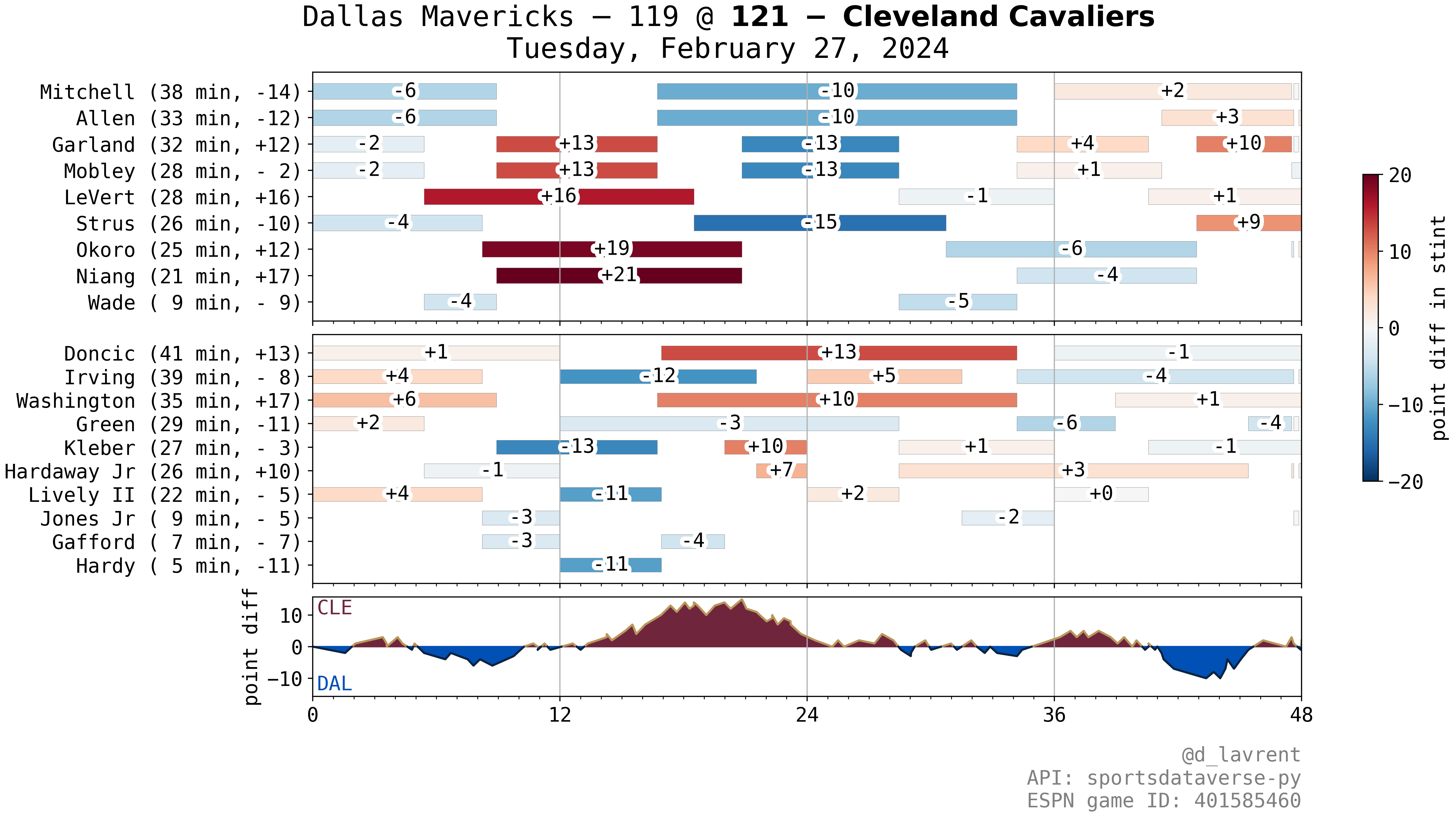
Interactive Game Rotation Plots
Web app here!
Generate (and customize) a rotation plot for a game of choice in the 2023-24 season at apps.plotandroll.com/game_rotation_app/!
Backstory
I’ve been posting a plot like this after each Cavs game in the 2023-24 NBA season:
 Example rotation plot of the Max Strus 59-foot buzzer beater game
These kinds of plots are also available on PopcornMachine.Net, and in the ‘Plus/Minus’ tab for individual games on Basketball Reference.
To make my own version, I used the excellent SportsDataverse Python package to pull play-by-play information from a game using an ESPN ID (the numeric code you see in an ESPN boxscore, i.e. the 401585460 in https://www.espn.com/nba/game/_/gameId/401585460/mavericks-cavaliers).
From the play-by-play data, I parsed out substitution times for each player, and counted the game score at each substitution time to get +/-’s for each player shift. This worked pretty well, but I noted sometimes my +/- counts would occasionally be off by a point or two (I’m pretty sure I didn’t manage some edge cases correctly like when players get subbed onto the floor during another player’s free throws).
(I promise to release the sportsdataverse-based code to GitHub by the way, I need to reorganize some stuff!)
But also, a couple of weeks into the season, I learned about the nba_api package and was blown away by the volume of data I’ve always wanted access to. One of the endpoints that this API client lets you get from nba.com/stats is called GameRotation, and, given an game ID (an nba.com one, different from ESPN), yields the following type of information an hour or two after the game is played:
| GAME_ID | PLAYER_FIRST | PLAYER_LAST | IN_TIME_REAL | OUT_TIME_REAL | PT_DIFF |
|---|---|---|---|---|---|
| 22300832 | Kyrie | Irving | 0 | 4930 | 4 |
| 22300832 | Kyrie | Irving | 7200 | 12920 | -12 |
| 22300832 | Kyrie | Irving | 14400 | 18900 | 5 |
Perfect – in/out times for each player stint, along with the point differential.
I was particularly inspired to try to make a web app after coming across this blog post by @SravanNBA (a great follow on Twitter!) – the post made it much more approachable to get started with Shiny Server, and I was excited that I could keep all my code in Python.
So, in all, I swapped out my manual parsing code with the data from the much more legit nba.com using nba_api, automated the accessing and storing of the relevant game data, then I took a few weeks to learn Shiny Server for Python and wrangle with a virtual machine on Oracle Cloud (I didn’t and haven’t yet had to pay a dime, and again a hat tip to Sravan for mentioning this as a computing resource on Twitter), and the result is the web app linked above.
I made a couple of stylistic changes to the plots compared to what I post on Twitter (now the away shift plot is on top of home, and I keep things in the AWAY @ HOME format as much as possible). You can choose from a couple different diverging color palettes and optionally put +/- differentials onto the shifts.
The code for the Shiny app is available on GitHub. I am happy to hear feedback or answer any questions or field suggestions! You can reach me on Twitter or via email.